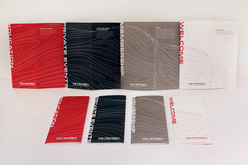
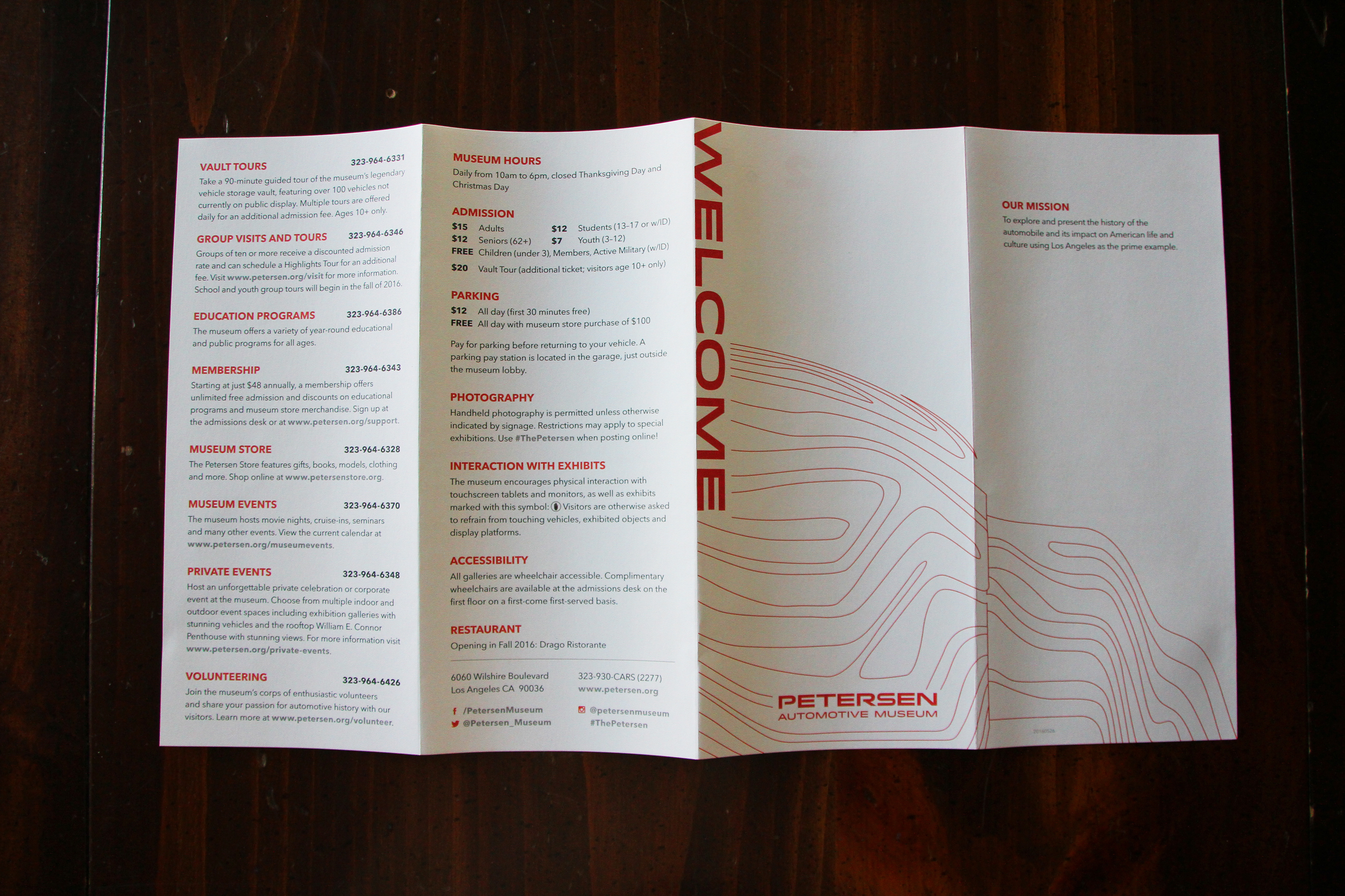
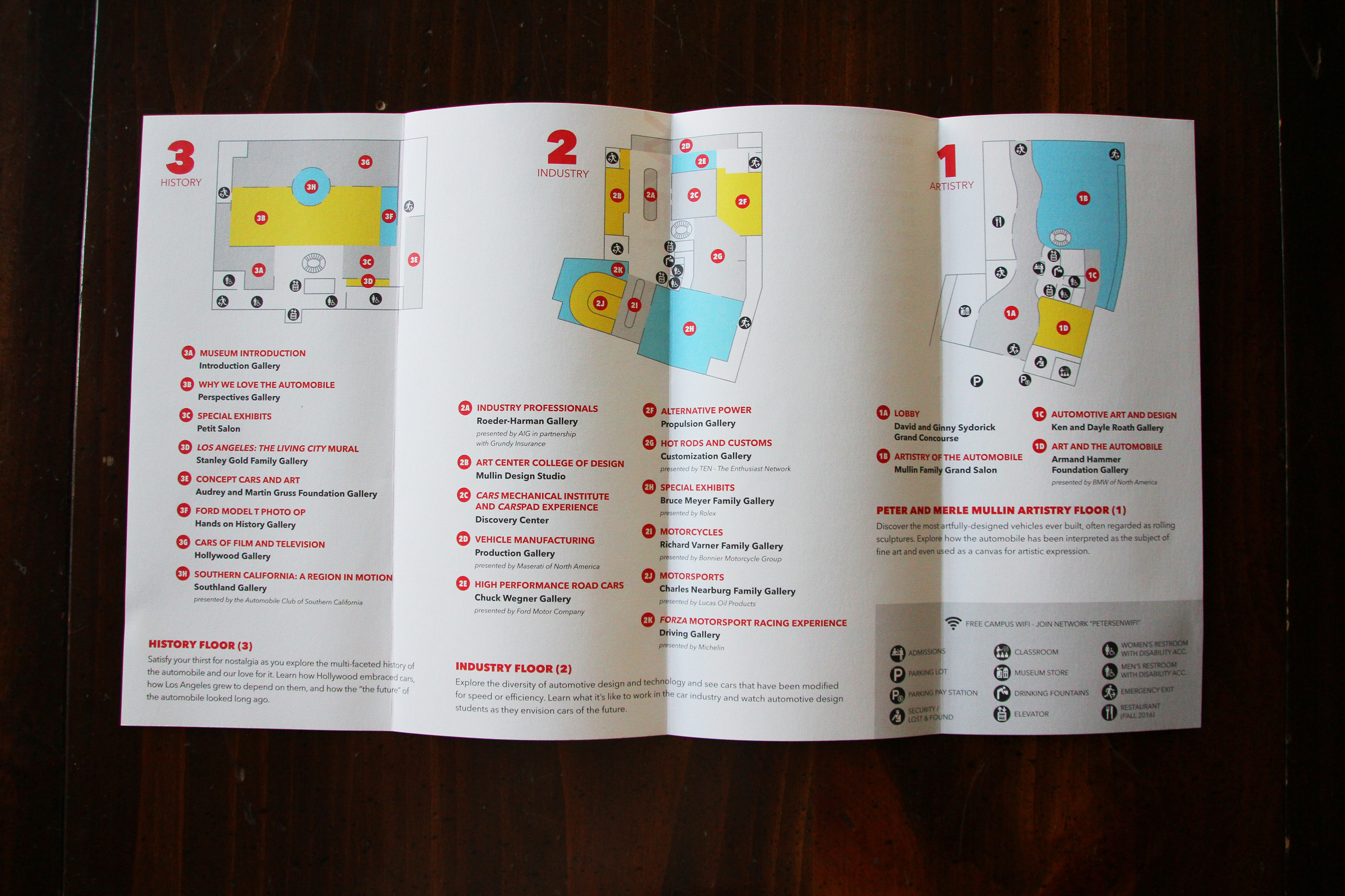
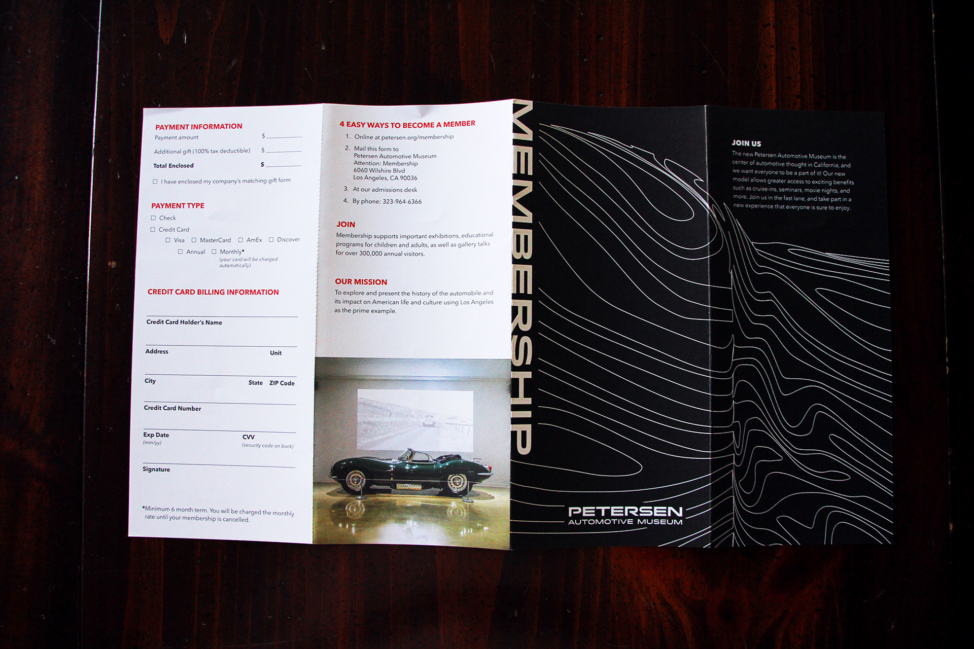
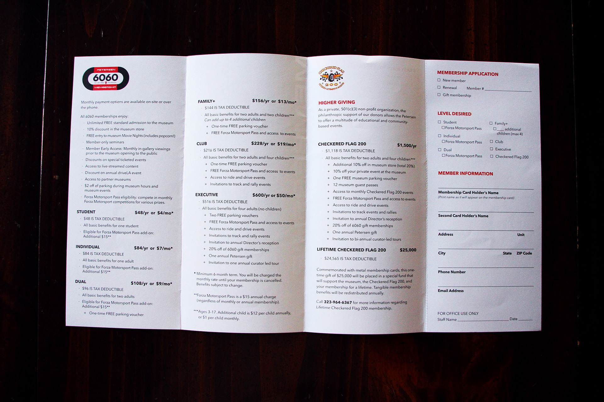
After its reopening in 2015, the Petersen Automotive Museum had a massive design overhaul. One project I tackled during renovation was redesigning the visitor guide and brochures given at the admissions desk. It was decided that the fold and size would remain the same as the previous brochures, but I saw an opportunity to brand the brochures in a new way. Using the illustration of the new facade of the museum as my main graphic, I conceptualized a simple way for the brochures to stand out individually, but unite as a family when together.
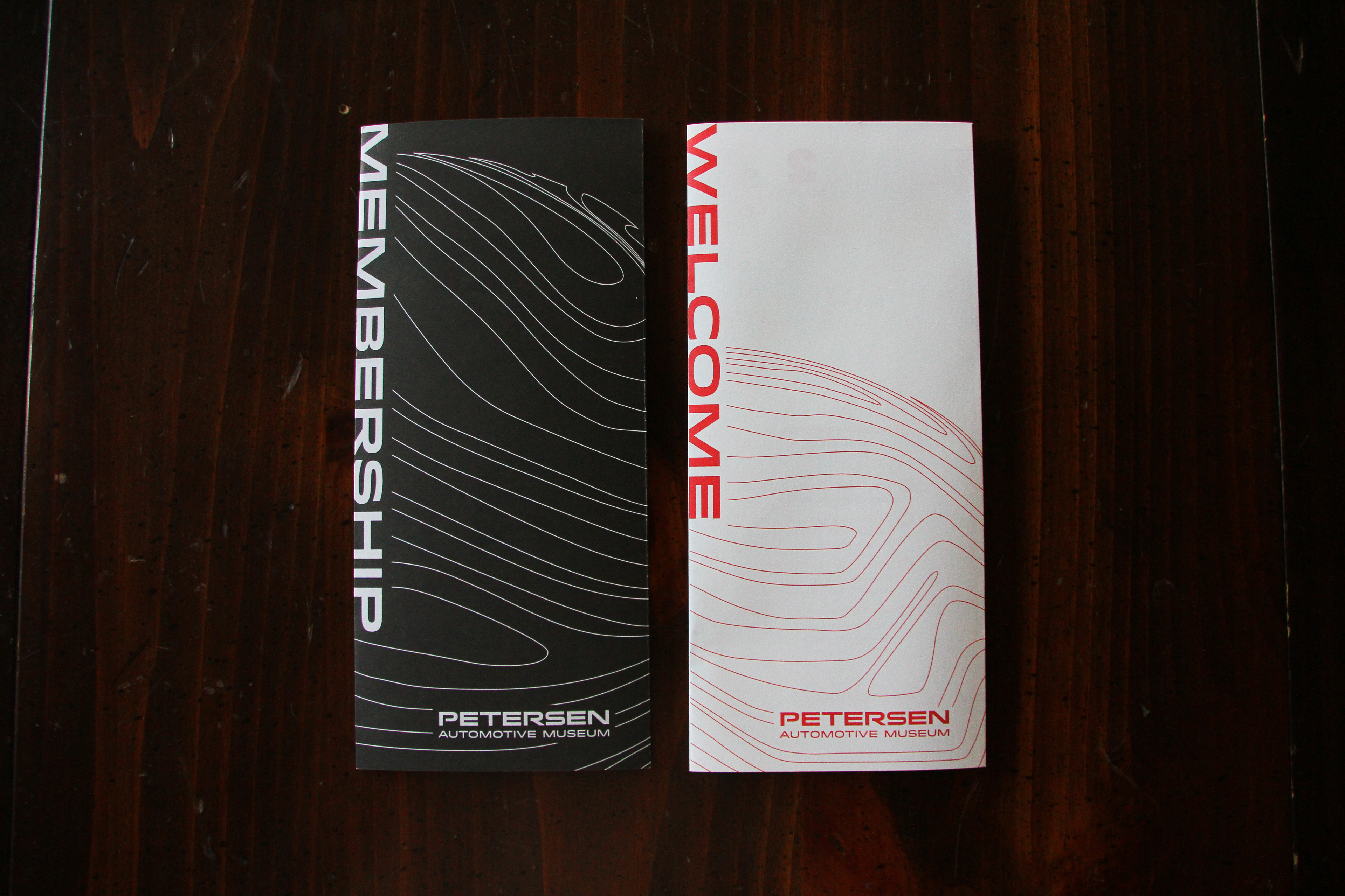
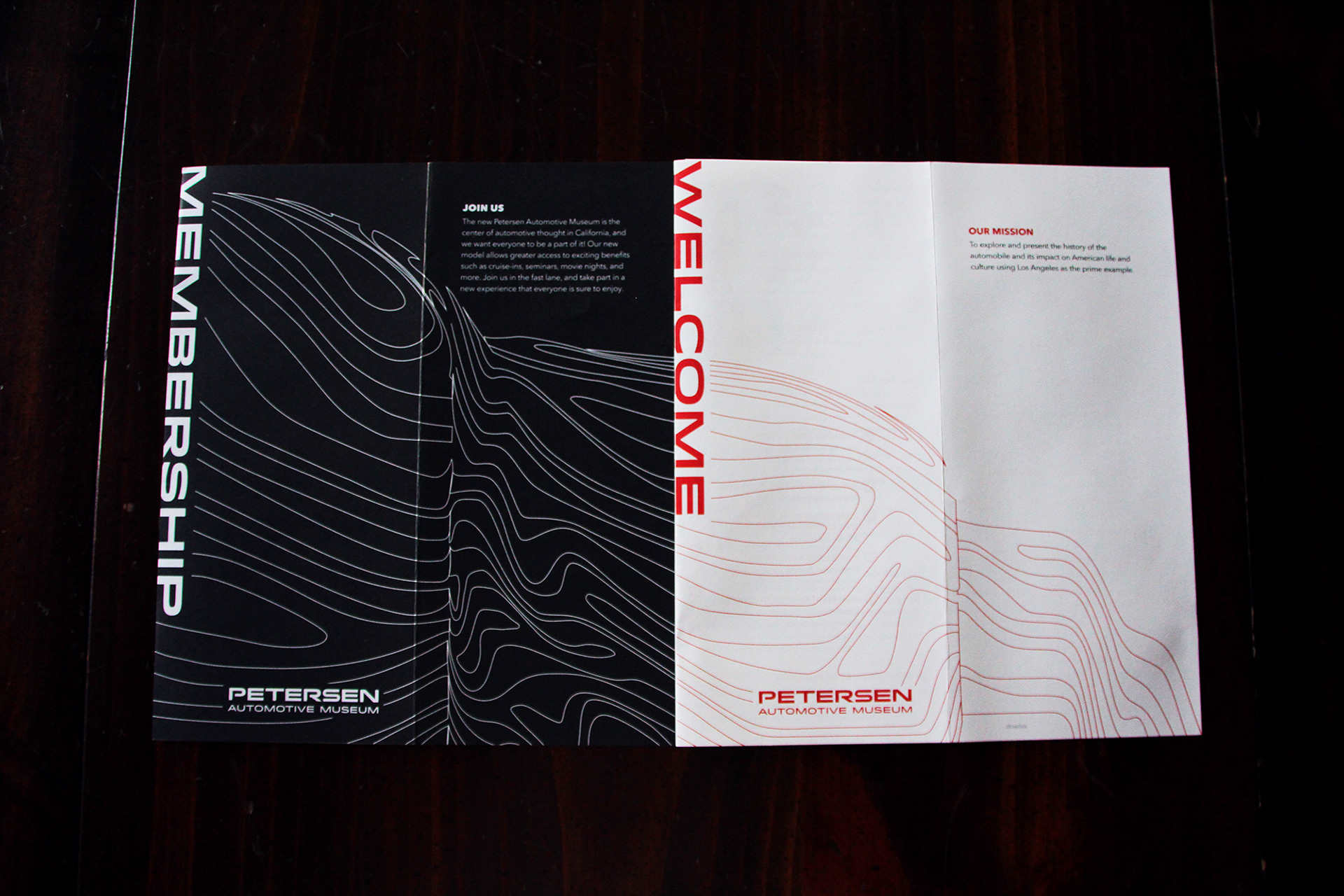
Below: While the entire design and proposal was to create four brochures, two were executed: the visitor's guide and membership brochure. Nevertheless, the two showcase the unifying "Easter egg".
Below: Proposed layout and design of the full brochure family.